
BRAND IDENTITY AND PACKAGING FOR A BOTANICAL
BEVERAGE CONCEPT ROOTED IN FUNCTIONAL WELLNESS.
BE Botanical Elixirs is a passion project born from a desire to explore a more illustrative approach to the modern better-for-you beverage space. In a category often defined by highly polished and minimalistic design, I wanted to showcase how hand-drawn, stylistically eclectic, illustration could create something that felt equally contemporary—while bringing more warmth, personality, and storytelling to the shelf.
ABOUT THE BRAND
BE’s commitment to holistic wellness and top tier quality was at the core of the design process. The packaging features hand-drawn illustrations in a sketched, organic style that highlights the key ingredients, reinforcing the brand’s connection to nature, alongside color, type and layout choices. The result is an inviting, organic aesthetic that reflects the brand’s commitment to high-quality and natural ingredients, and resonates with the target wellness-oriented consumer.
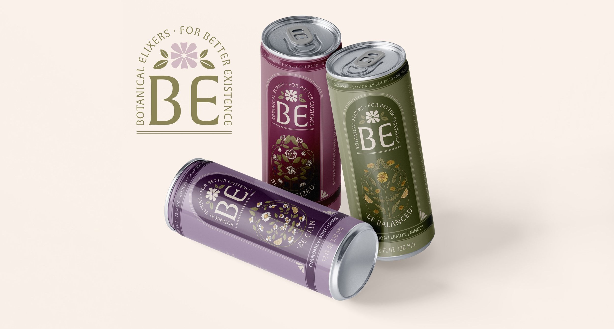

To parallel the organic, plant-derived ingredients that go into Botanical Elixirs, I created a collection of hand-drawn illustrations for the packaging. Using the standout ingredients in each unique flavor profile, I created organic, sketched designs that emphasized the harmony between all of the natural ingredients.
ORGANIC ILLUSTRATIONS


The color palette draws directly from nature, inspired by the hues of the ingredients in each elixir—purple acai berries, green dandelion leaves, and yellow lemons. Each color also reflects the mood the beverage is meant to evoke: calming purple , happiness inducing yellow, balanced green, and energizing maroon, creating an intuitive and sensory connection between the drink and its effects.
COLORS INSPIRED BY NATURE
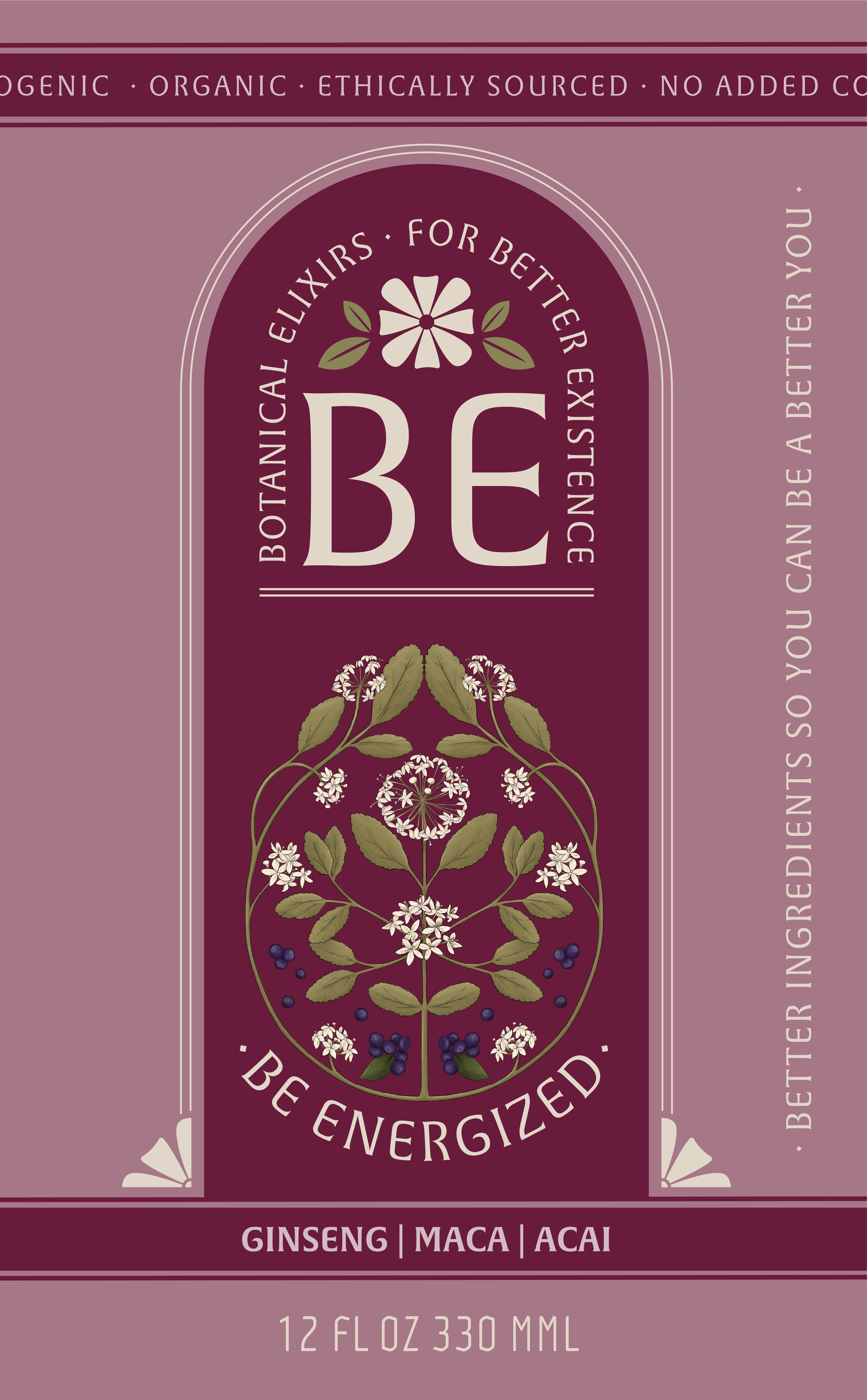
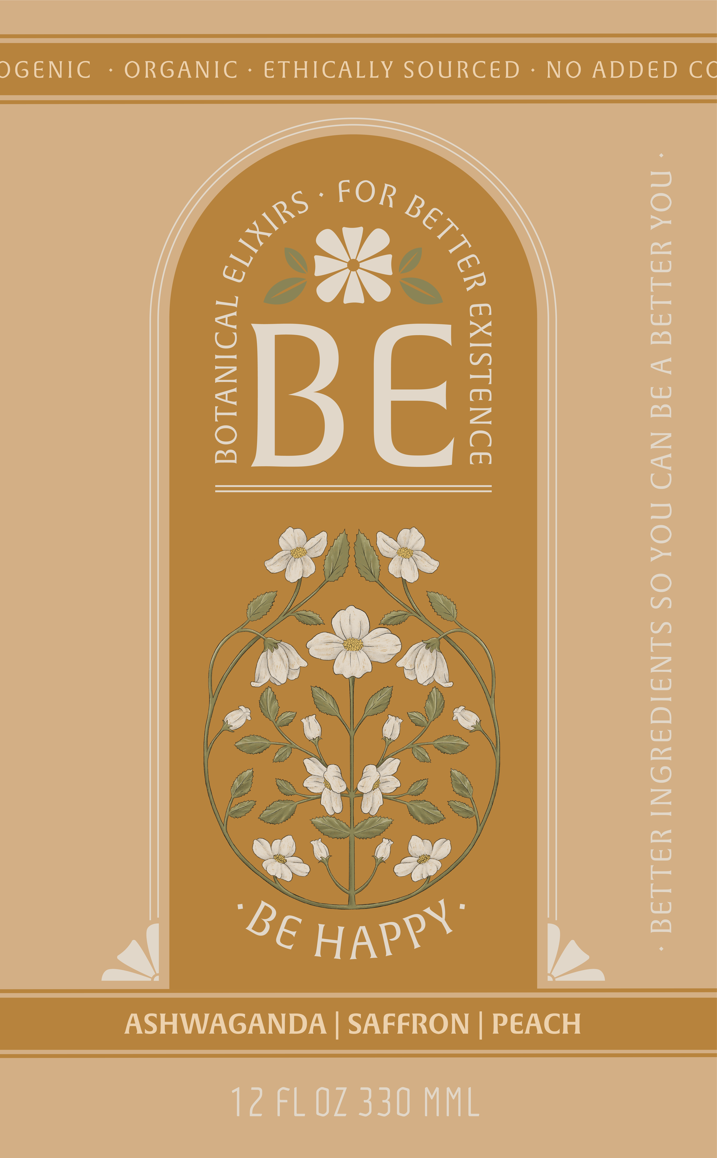
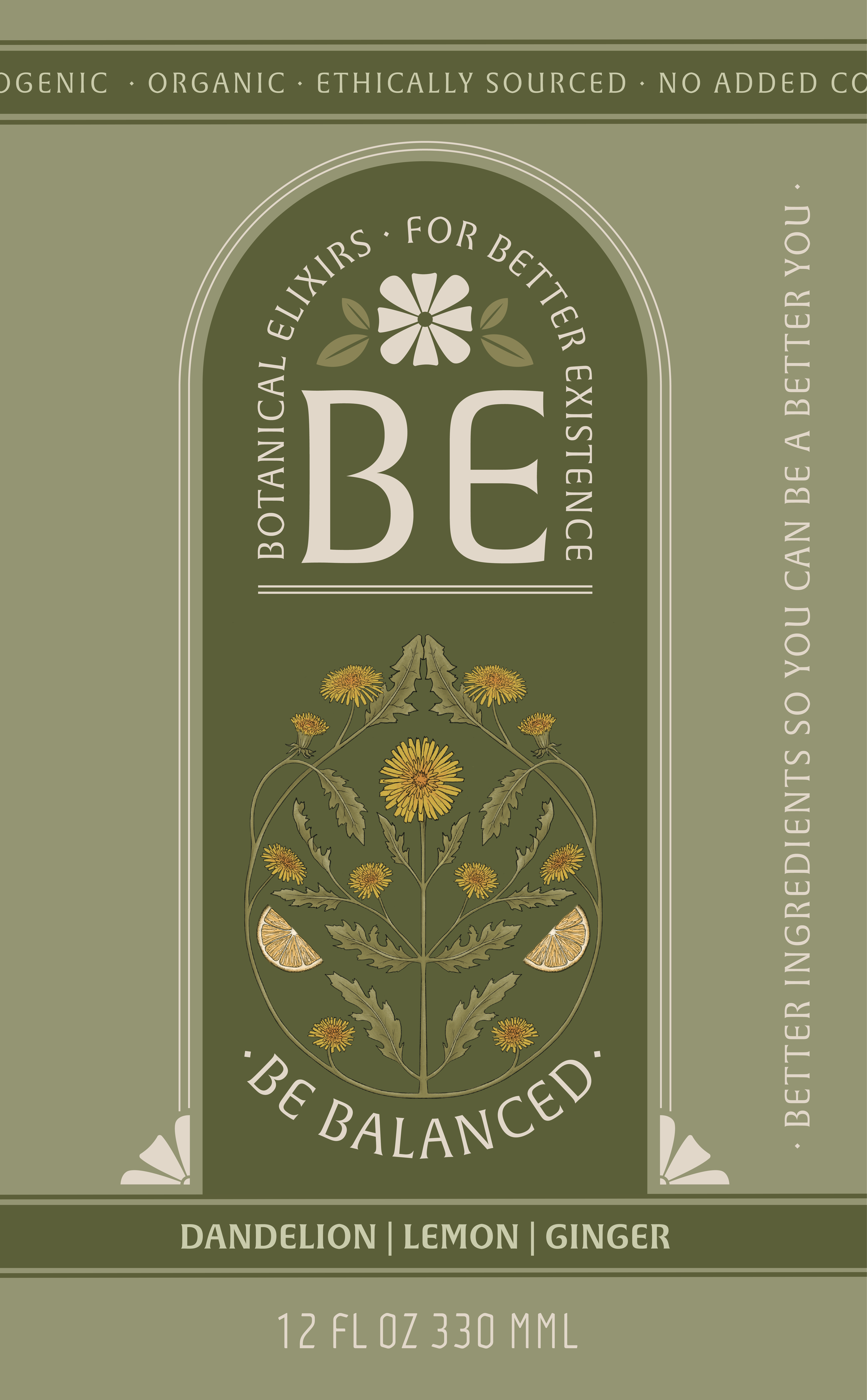
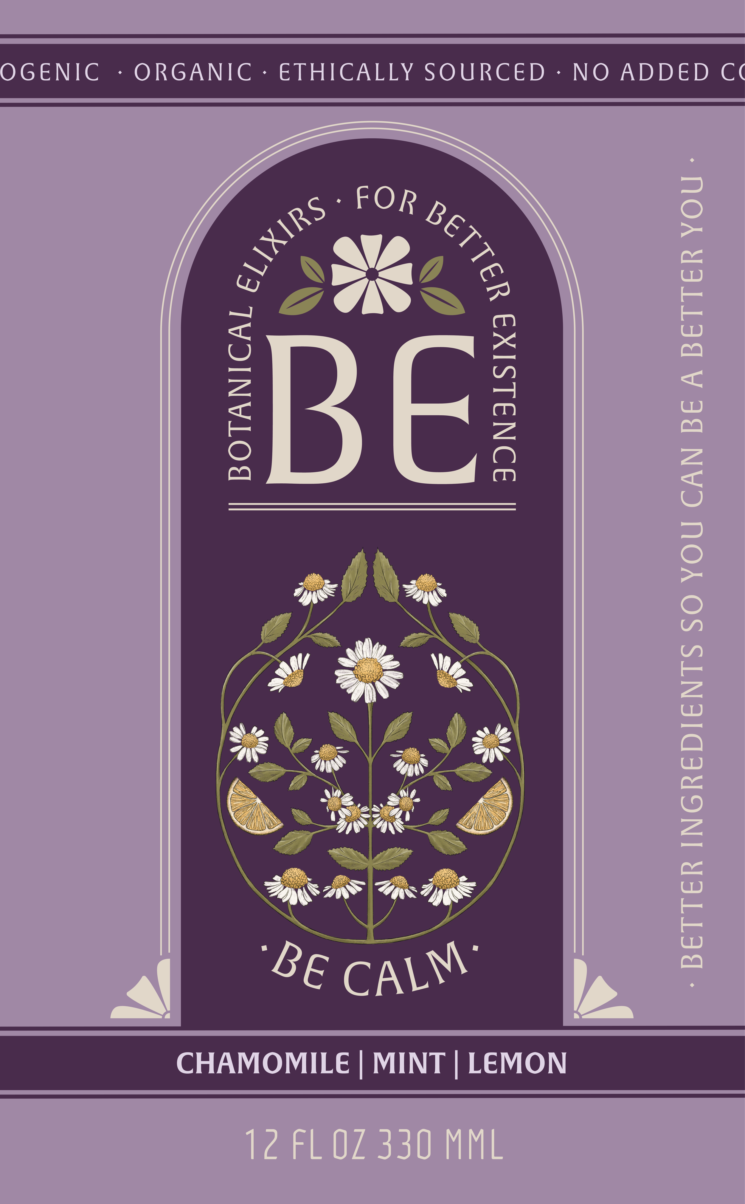

The branding and packaging for BE Botanical Elixirs blend an eclectic and vibrant aesthetic with a deep connection to nature. Hand-illustrated botanical elements highlight the drink’s natural ingredients, while a bold, earthy color palette reflects both the flavors and the emotions they evoke. The result is a fun, expressive design that feels both organic and energizing, inviting consumers to embrace wellness in a visually rich and engaging way.